
Better Form Design: Starting with Labels
Any time the user interacts with a website or application is a critical point because it moves the conversation forward, and presumably closer to fulfilling the user’s objectives.
The Most Important User Interface Component
On screen forms are more critical interface points compared to other user interfaces because they demand much more from the user. Other interface methods, such as links and buttons require no more than a firm decision and a single action from the user (a mouse click, for example) to move the user experience forward. Not so for forms. Forms will often require the user to stop, think and supply the application with information. It is the most demanding of all the user interface elements. It is a very intimate, two-way conversation between the user and the application. This makes it very important for you to carefully design your forms, especially if it is one that requires the user to answer more than a handful of questions.
Dedicate some time for your form’s design
The form acts like a speed bump along the road, interrupting what could otherwise be a smooth ride toward the destination. Steve Krug, bestselling author of what is arguably the layperson’s bible of usability and user experience design, “Don’t Make Me Think,” says that there are only a few things you need to keep in mind when designing the user experience. These, he says, take nothing more than common sense and should be simple enough for anyone to do. Among the principles of good usability are making sure that things work the way they’re supposed to, the design should be able to explain itself to the user, the application should not make people think — and most importantly — it should not waste people’s time. Absolutely the same principles hold true for onscreen forms.
Asking the Right Questions
In terms of how they work, there isn’t much difference from one form to the next. A form is simply a series of questions which the users need to answer. There may be subtle or cosmetic differences to how a form may handle this; some forms let users fill a box with answers, while others may ask the user to pick from a set of possible options. But at its heart, any form asks questions that the user must answer. So the question now is, what is the best and most efficient way to ask the questions? And, are there even any differences to how questions can be asked? Isn’t the process of asking a simple and straightforward matter of finding out?
There are apparently many different ways you can ask questions, and there seems to be a science to it. That is why there are people whose jobs are all about asking the right questions — police investigators, immigration officials, credit and loan investigators and such. These are people who know how to get the answers. They are masters at getting into the heads of the people they are asking.
But what about web forms? How can they ask questions so that the user isn’t bogged down? How can the experience of filling out a form become as simple, as smooth and as easy as possible? Because absolutely no one enjoys filling out a form. After mindlessly surfing the Web on mouse clicks, having to actually stop to think and type answers on the keyboard is the cyber equivalent of being stopped and interrogated in the middle of a race. To say that it is annoying is being kind.
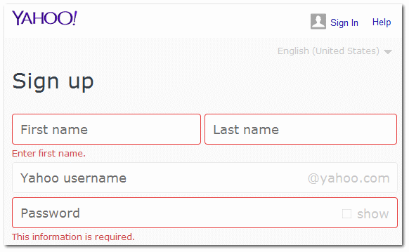
But there is a way to make sure that forms, despite the nuisance they represent, can be made not to detract from the overall user experience. And (Steve Krug was right!) it takes nothing more than common sense to accomplish this. Just as it is important for interrogators and investigators to ask the right questions, so too, must forms be able to communicate precisely what information they need from users. The labels that accompany each box or set of answers, describing what the user needs to put into these boxes or which choices to pick — this is the key to making a form easy and usable.
How to Keep the Questions Simple

The rules are few and very simple, built upon the same principles of common sense that drive effective communication. First, labels must communicate just enough for the user to know what is being asked of him. To ask, “What is your name?” is unnecessary when simply stating “Name” is enough for the user to understand. Brevity is elegance.
However, do take note that it is equally inelegant to be overly brief to the point of sacrificing meaning. Many abbreviations are either ambiguous in meaning, or absolutely meaningless. Asking for the user’s “TIN” could get the user thinking about a “Technical Information Network” or his “Tax Identification Number.” Or worse, it may not mean anything at all.
Next, it is best to say what you mean and mean what you say, especially with the labels that describe the action buttons. Say “Subscribe to the newsletter” if that is what you mean to happen, rather than the generic “Submit” label that does not have anything to do with the conversation.
Converting Questions to Labels
A question becomes a label when you place it next to the right input element. Placement of the label is important because the proximity to the input is the key indication of which label corresponds to which input.
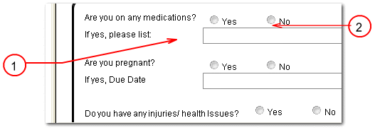
Notice the gap between the label and the input (1) and the proximity between the input elements
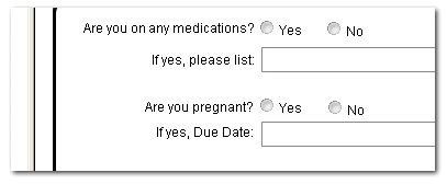
See how the proximity conveys the relation between the elements. Even such subtle changes can make your form better.
For more such tips on building better forms, signup and get a free ebook here!