
Simfatic Forms New Release – Responsive Forms
A new update of Simfatic Forms 5 is available. Version Simfatic Forms 5.0.4
This update improves the responsive features of Simfatic Forms.
As you know, Simfatic Forms gives you the flexibility to place the form elements in any way you want, rather than restricting in a vertical-only layout. This limits Simfatic Forms in making the form ‘responsive’ (change layout based on screen size).
Simfatic Forms 5 comes with two options: You can layout the form the way you want & still
keep it working with mobile devices
OR
Enable an auto-responsive option that fits the form elements automatically to a vertical layout.
Here is a quick demo of the feature
https://www.youtube.com/watch?v=N4YGSJVs6Qk
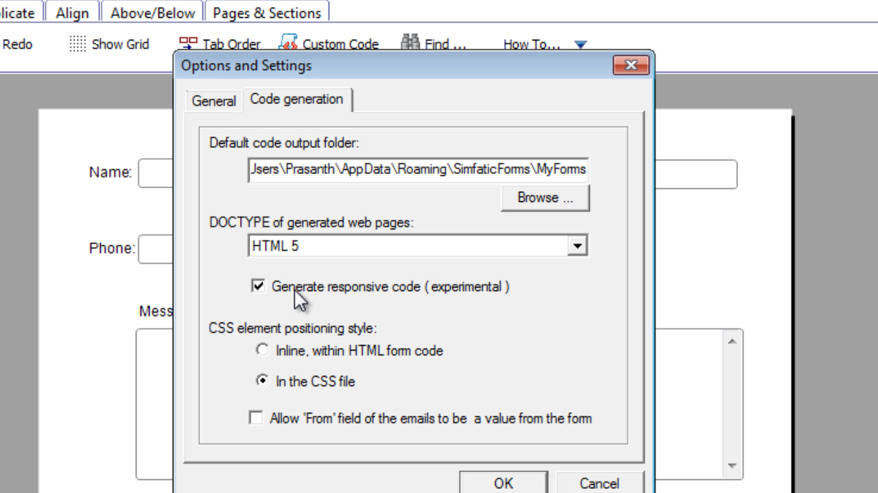
Simfatic Forms 5 adds a setting in the Tools->Options dialog box.
Enable ‘generate responsive code’ option. If this option is enabled, Simfatic Forms will force’ vertical layout in small screens. Larger screens will show the form in your original layout.
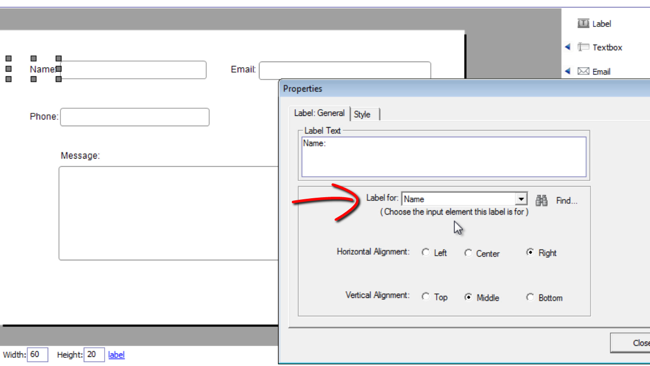
Next, make sure the label for each element is assigned correctly. Simfatic forms tries to assign the label to the element automatically. However, it is always better to make sure the label is assigned to the right element. Select the properties of the label and then check that the correct input element is assigned.
You can download the latest Simfatic Forms update here